Sunday, 28 February 2010

Test Shoots ..

Here are a few of our test shots that we have done. We mainly did to try out some lighting styles to see which one worked better for our campaign. We used some props at first just to use something to see the lighting on as we didn't have a model at first.


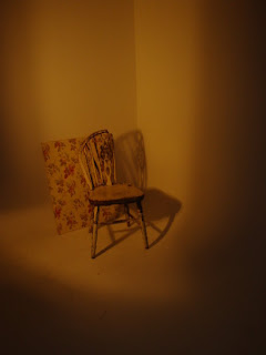
This was the first shot we did and we used the board not only as a prop but we liked it as well. It was convenient that it was in the studio at the time but it was perfect for our campaign as it was floral and really on trend for Spring/Summer.


This is me attempting to be the model ... as you can see I'm not cut out for the business lol.


We also introduced a chair which I also LOVE!
It is an old weathered chair which again I think fits in great with our whole Spring/Summer campaign. It looks quite country which is the thing I want to do.
Out of the three lighting themes we tried I like the last one but it is too dark to use on a Spring/Summer shoot.

Our model showed:


Here a few lighting suggestions with the use of a model. Again I like the dark ones with the spotlight as they are quite dramatic but are definitely not suited for this assignment.

We all decided on this final shot been the best lighting arrangement as it's the brightest which is perfect for Topshop and it will compliment the model.

Friday, 26 February 2010

Model Poses ..

We booked the studio for our test shoots and for the real thing. As the date is getting closer I decided to look through magazines and see what other companies have done for there shoots.
I thought if I just looked at model poses it would gives us a better idea to what we want our models to do and it will save us time when we get to he studio so we wont waste our time and not get as many shots done.

Poses that I found:


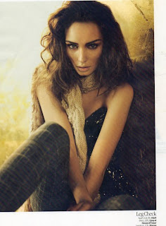
I found these images in Grazia magazine. It is one of there own shoots.
I think all of these poses are strong. They show good definition of the model and if we can get the model to do poses this well it will look very professional which is what we want.

Poses the rest of the group found:


I don't really like this photo as she looks a little creepy. I suppose it would be alright if we changed the models facial expressions but it's still not very Topshop in my opinion.


I like most of theses poses but I think a few are a little weak. The Guess advert is a good one as the models look great and very strong. It would be interesting to do a two model shot as Topshop also use two models in some of there adverts.

Kate Moss ..

I was just looking around on the internet and came across the Kate Moss shoot for Topshop. Some of these images are good and are another prime example of how Topshop use subtle backgrounds but still make the image look strong.


All of these images are strong and use excellent lighting to emphasis the clothing. I think it definetly helps that Kate Moss is a brilliant model and knows exactly whats shes doing. A good model can make a photo.

These next images are my favourite ones that Topshop have done with Kate Moss.


The effect this images has with the lighting and the shutter speed that has created that movement effect is fantastic. I would really like to attempt doing this with our campaign just to see how it would look.
The make-up is just right for this shoot aswell so we definetly need to think about the hair and make-up as it plays quite a big part in the shoot.

Topshop ..


Topshop was our given company to do this campaign for so as a group we decided to look at the store and see what there style was.


Here are some Topshop adverts we found in a magazine. There style is quite simple and nothing too fancy or special. The clothes are casual with not too many accessiories.
From looking at these pictures it's clear what type of clothing we need and to not over accessories and make it too fussy.


Here are afew others I found. The main thing I've noticed is the background to them all. Eventhough there are on location, well I think they are they don't look as if there in a studio, they are still simple and not overworked. Always using light or dark backgrounds. This is the main reason we chose to use the studio for our shoot.

Monday, 22 February 2010

Corinne Day's Work ..

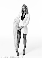
Here are a few shoots that Corinne Day has done. I thought it wuld be a good idea to research into her styles and take some good tips from it.


I liked this image as it is a simple piece but it's the use of the head garment that makes it interesting. Without that piece it would just bit a little bit dull and so so. The colours contrast greatly with the black background.


I have chosen to look at these images because as a group we decided on doinh our shoot in a studio as it gives more of that Topshop feel. These are perfect examples of good studio work and I think with a bit of practise there is no reason that as a group we can't produce this kind of work.
I especially like the one with the scarf where Corinne as clearly used a fan to get that effect. We should look at doing something simpliar but adapting it to the garments we choose for our shoots. As we are doing a Spring/Summer shoot for Topshop the floatyness of this fabric is perfect. It will give off that perfect look that we are after. Well I am after i have yet to discuss this with the group so I can't get ahead of mnyself.

Wednesday, 17 February 2010

Corinne Day ..

In a group meeting we had it was decided that we were going to look at the photographer Corinne Day for inspiration for our shoot.

A bit about her ..
Corinne Day is a self-taught British photogapher who is quite famously known for taking the first model shoots of Kate Moss in 1993. She also created the 'waif' look.


Clients:
Most of her work today can be found in British, Italian and Japenese Vogue. She also does work for Face magazine.

Career History:
Corinne is known for developing long-term relationships with all of her models as she feels it produces better imagery if the model feels comfortable with the photgrapher. She has now produced a book called 'Diary' which is about all of her friends i think. I'm trying to find out more about that but it's seems hard to research.

Style:
She started out shooting the Grunge look but grew into a more international style as her work got more publicity. She is against the use of airbrushing in her photos which is a shame as for this project we will be using Photoshop to adapt some of our images.

Personal History:
Corinne day was born in 1965. Her parents split when she was young sp she grew up with her grandparents and brother. She is said to have had a happy and idealic childhood. Before she was a photographer Corinne was a international glamour model and made quite a sucess out of it but in the end found it wasn't for her. She also developed a brain tumor somewhere along the lines but I'm not quite sure on the dates but she survived and is healthy now.

That is just a little bit of info I found on Corinne Day.

Other Wonderland Shoots.


These images were photographed by Miguel Reveriego for Wonderland.
I think they are amazing as they give off this artistic feel to them yet still holding that high fashion concept.
This is the kind of thing I imagine our photoshoot to look like as I want it to be a bit quirky but not too much that it scares away Topshop's customer base. These will be perfect to show my group at our next meeting.

Wonderland Imagery.

Liv Taylor Shoot:


I think this shoot is gorgeous! I think they have made the actress look stunning but still kept that edgy kinda look with poses they have chosen.
I love the effect it has in black & white and this could be a good concept to bring up to the rest of the group as black & white imagery always looks professional yet on the other hand it may not be such a good idea as we are doing an advertising campaign and you can't advertise clothes properly when you can't see the colour of them. It won't give off any type of colour trend or pattern which is what Topshop's adverts normally portray.

Megan Fox Shoot:


After looking through a few shoots the Megan Fox one is my favourite. Maybe it's because I think she looks stunning in these photos or it's the location and poses she's been put in but the whole thing works.
As they are in colour I feel it fits better with the whole Topshop concept of things as I could actually see these photos going straight into a Topshop window.
The big hair ans dramatic eyes that the make-up artist and hair stylist have given her has really made an impact to this shoot I think. It creates this whole glamorous feel even though the actual location isn't all that glamorous.
The black & white photos are good as well I especially love the face one as it shows a good element of beauty. This has clearly been done using photoshop in post-production. I would like to have a go at getting that effect myself so I may have a play around on Photoshop with a photo of my own some time.