After completing this project I feel I have learnt a lot about visual merchandising and the methods used. This is an important thing to learn in my opinion as if I want to carry on into digital technologies it will be a good source to keep in mind.
After careful consideration and research I was able to choose the store and method that was suited to my choice and I have come to realise that everything needs to be thought out and you cannot rush into things and just do them as the outcome doesn't work out like you had planned. My first initial idea would have been a good one but I didn't think ahead to the point that my abilities didn't stretch that far to complete the Photoshop work it would have needed. I did give it a good go but it just wasn't happening for me.
My skills on Photoshop have definitely developed and doing this project has opened my eyes to new features on there that I had never noticed before. A few more months or so of using Photoshop and I think I will be quite skilled on the programme and will be able to complete tasks to a better standard.
Thursday, 22 April 2010
Wednesday, 21 April 2010
My Chosen Locations ..
Here are my chosen locations and the images I have chosen Photoshopped into the photos. The first one is the classic bus advertisement ..

This concept has been around for years showing that it does work. I have decided to upgrade by changing the paper posters to small flat screens that show digital images. You can then show multiple images instead of just one.
The second image is a visual screen in a shopping centre ..

This is another visual merchandising campaign that has been used for years. I have only chosen this idea because it reaches out to a wide audience and can be used all over the country without any effort.
The third place I have chosen is the cinema ..

This is a good idea I think because instead of paying for a moving advertisement you could just have a still image like this one and have it flash up between each advertisement before a film. The image would of course change every time but by the time the adverts have done New Look will be painted into every one's head.
Monday, 19 April 2010
The New Idea ...
As the last idea wasn't going to work I have to come up with a new one that is more suited to New Look. After researching into New Look and looking at what they already do it's clear they use strong fashion images. Here are some of their previous posters ...


The two current faces for New Look are Alexa Chung and Taylor Momsen. They are up to date and in fashion so they are perfect. The best way of communicating visual merchandising is to print their faces EVERYWHERE! Trying new places and concepts.


The two current faces for New Look are Alexa Chung and Taylor Momsen. They are up to date and in fashion so they are perfect. The best way of communicating visual merchandising is to print their faces EVERYWHERE! Trying new places and concepts.
Sunday, 18 April 2010
The mannaquin ...
As I think more about what type of mannequin to use I decided against a full bodied one such as this ..

I decided on this as it is going onto the high street where there are families and young children around and some people might not appreciate this type of model. Also I don't think it fits with the New Look image. I am trying to go for a more classic style mannequin that's more fashion related like these ones ..

You can ask anybody and if you show them a this type of mannequin the first thing that springs to mind is fashion which is just what New Look is all about. Now to keep it innovative and fashionable I was thinking of making it less boring like maybe using different fabric on the mannequin with different colours for the different cities. Maybe something like this ..

I think mannequins a bit like these on the high street with the interactive pads would spark a lot of interest. The best way of showing this is a New Look campaign and not just an art piece is to print the logo onto the mannequin. This would show that New Look are getting more exciting and adventurous. The logo I would print onto the mannequin is one like this ...

This idea would be perfect if New Look only had a bigger budget. It just seems too arty for an economy store.

I decided on this as it is going onto the high street where there are families and young children around and some people might not appreciate this type of model. Also I don't think it fits with the New Look image. I am trying to go for a more classic style mannequin that's more fashion related like these ones ..

You can ask anybody and if you show them a this type of mannequin the first thing that springs to mind is fashion which is just what New Look is all about. Now to keep it innovative and fashionable I was thinking of making it less boring like maybe using different fabric on the mannequin with different colours for the different cities. Maybe something like this ..

I think mannequins a bit like these on the high street with the interactive pads would spark a lot of interest. The best way of showing this is a New Look campaign and not just an art piece is to print the logo onto the mannequin. This would show that New Look are getting more exciting and adventurous. The logo I would print onto the mannequin is one like this ...
This idea would be perfect if New Look only had a bigger budget. It just seems too arty for an economy store.
My Initial Idea ...

I visited Nick Knights Somerset House Exhibition - SHOWstudio. I went there last year on a trip to London with the university and it was there that I witnessed Nick Knights work of Naomi Campbell. It was named Naomi.


Nick Knight has always photographed Naomi Campbell all the way through his career and that's why he has decided to use her in this piece of work. This project 'is a sculptural rendering of her body using 3-D scanning technology and rapid prototyping, creating a monument of the model as a cypher for our preoccupations and unwavering interest in the culture of celebrity.' I got this quote from the official SHOWstudio handbook that I bought.
The general idea I am getting at is the sculpture. Nick Knights concept clearly as meaning and is about something whereas I am just interested in the technical part of the piece and the idea.
All the piece is is a giant sculpture which is hooked up to a computer that the general public can operate and draw images onto the sculpture digitally. They can do what the please and when the next person comes to use it the computer gets wiped and you start again with a plain canvas or sculpture in this case.
Here is a image of the sculpture when it has been drawn on:

I was thinking of taking this concept and scaling it down to a more of a retail level. As I have decided to go with New Look as my company I was thinking of using a more fashion related sculpture rather then a celebrity. Something everyone could relate to and know it's fashion based like a mannequin or something?
Anyway we put the mannequins or whatever other sculpture I decide on in the high streets. In a glass box maybe to stop vandalism as you have to think of these things. With a little touch screen pad that people can use to draw images into the model.
I think this is a great idea that is interactive with the public and has not been done yet. It will defiantly drum up some media attention which is what visual merchandising is about.
The only reason I am not going to use this idea for this project is because it is for New Look. It's a quite art based idea and out there which just is not suited to New Look. The customer base for New Look is a large one which doesn't fit with the inventiveness and creativeness for this idea. Even though I will not be using this idea because of the reasons above I wanted to publish this idea on my blog to show that I can have good interesting ideas but with my ability on Photoshop and the customer in mind it just will not work.
Next year or the year after when my abilities on Photoshop have improved then I will develop this idea and maybe put it into another project as I think it's a great idea.
Kolarcraft Trip ...
As part of this project of coming up with a innovative idea of visual merchandising I visited the Kolarcraft factory in Wakefield. They design and make visual merchandising products such as posters, stands and displays. First there was the Design Foundry where all of the initial ideas and actual designing goes on. This was the more appropriate part of the trip as it had more relevance to my studies.
I found it interesting to see what goes on behind the scenes and how they get to the conclusion of what to use and what not to use. Here is a photo of some of the things they create there. As you can see there is a Malteasers display and a Walkers crisps one which actually won an award.

The Kolarcraft factory wasn't really my thing as it was more manual work but then again it's always a good thing to see how the industry works to get a better knowledge of the field. Here are a few photographs of the place.


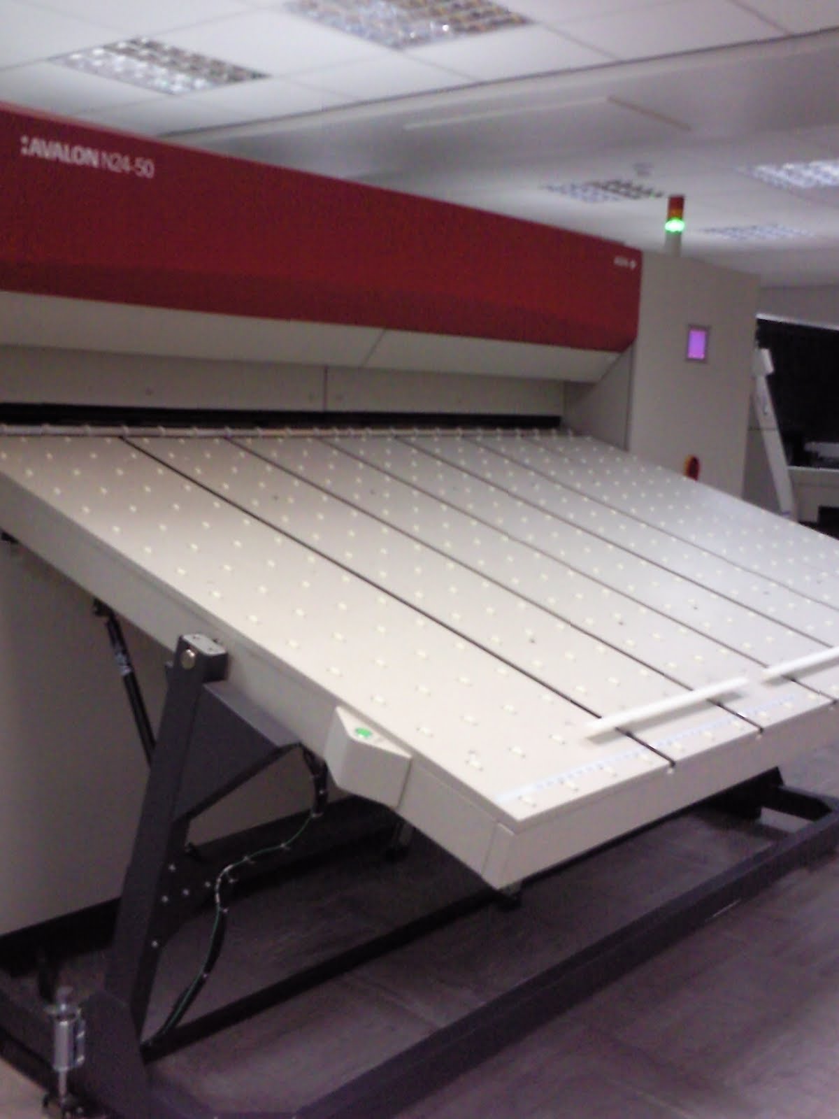
This machine was the first one we looked at. It was interesting to see how complex the whole thing was as I've only witnessed the final outcome in stores. I didn't realise how much went into it all.

This machine basically makes prints clearer and gives the product a better finish.

This machine creates the print screens that make the actual prints that go into stores. As I have experience with using print screens (not on as larger scale as this) so I understood this part of the visit. I only used the printing technique at college but I feel t has given me some insight and skill that others didn't have.


These two images show where the screens get washed so they can be re-used and dried to keep them in good condition.

Here are all of materials the factory uses. They use all types of cardboard and paper. In my opinion it could have been stored a little better. It was just placed in the middle of the factory and it could in some way be useful there I don't know I don't work there but it just seemed a bit unprofessional. It maybe should have be stored in a separate room.


These are some of the finished pieces for New Look. It seems like a lot of work but the finished product looks good.

This was the part where final adjustments are made. Little touch ups and things. We were not allowed to take anymore photos from this point onwards as the things they were working on were advertisements that had not yet been realised. Privacy and copy write laws had been imposed.
We also saw how exactly they made stands and 3D structures and the packaging stage. The trip was entirely relevant to my course but it was to this project. I now know what exactly goes on in the visual merchandising business and will be probably better off for it.
I found it interesting to see what goes on behind the scenes and how they get to the conclusion of what to use and what not to use. Here is a photo of some of the things they create there. As you can see there is a Malteasers display and a Walkers crisps one which actually won an award.

The Kolarcraft factory wasn't really my thing as it was more manual work but then again it's always a good thing to see how the industry works to get a better knowledge of the field. Here are a few photographs of the place.

This machine was the first one we looked at. It was interesting to see how complex the whole thing was as I've only witnessed the final outcome in stores. I didn't realise how much went into it all.

This machine basically makes prints clearer and gives the product a better finish.

This machine creates the print screens that make the actual prints that go into stores. As I have experience with using print screens (not on as larger scale as this) so I understood this part of the visit. I only used the printing technique at college but I feel t has given me some insight and skill that others didn't have.


These two images show where the screens get washed so they can be re-used and dried to keep them in good condition.

Here are all of materials the factory uses. They use all types of cardboard and paper. In my opinion it could have been stored a little better. It was just placed in the middle of the factory and it could in some way be useful there I don't know I don't work there but it just seemed a bit unprofessional. It maybe should have be stored in a separate room.


These are some of the finished pieces for New Look. It seems like a lot of work but the finished product looks good.

This was the part where final adjustments are made. Little touch ups and things. We were not allowed to take anymore photos from this point onwards as the things they were working on were advertisements that had not yet been realised. Privacy and copy write laws had been imposed.
We also saw how exactly they made stands and 3D structures and the packaging stage. The trip was entirely relevant to my course but it was to this project. I now know what exactly goes on in the visual merchandising business and will be probably better off for it.
Sunday, 4 April 2010
Visual Merchandising ... Mannequin's
I have been looking at window displays and found that mannequin's make a big difference to the visual effects. Over the years mannequin's have been become more life like and have been positioned in innovative ways rather then just the basic boring stood up straight pose.
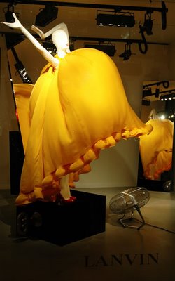
Here is am example of just how life like they look these days ...

Lanvin have done a good window display using mannequin's as one of the main focus points.


They have been organised in such a playful way that its so eye catching!
You don't really know where to look first which some people may say is a bad thing but I don't. I think with it been a window display you want people to be a little taken a back with it and stop to figure it out. That way people look at your store window longer than any others and it sticks in their minds!
Subscribe to:
Comments (Atom)
